LUT-coloured coat for «Narvik»

Behind the scenes with a costume sewn from chroma green material. Photo by Eirik Linder Aspelund
For the newly released movie «Narvik» by Erik Skjoldbjærg, we encountered a unique use-case for in-camera LUTs, as we were battling time schedules to find the perfect costume for our female lead.
It was pre-pandemic days when we first started prepping the movie about the largest ever battle on Norwegian soil. Our female lead was to be given an iconic coat that would fit her character, and at the same time help us identify her in chaotic scenes among fleeing civilians. We had an idea about what the colour should look like, but were unable to find a suitable fabric that would photograph how we wanted it.
We had considered different colours, but landed on a specific type of green based on what looked good on our actress, and at the same time triggered the right emotional response to her character. But green is a challenging colour in a landscape of uniforms, and the mossy kind of deep green that we wanted just didn’t translate to our Arri Alexa Mini LF, even if the fabric looked promising to the eye.

Early test of a green fabric that felt very desaturated on the Arri Alexa Mini LF
With a plain rec.709-LUT in the camera, the green fabrics would tend to desaturate a bit, and look more like a tinted shade of grey. We were already working on a custom colour palette for the movie, but saturating and tinting the greens in the LUT would affect other elements that we didn’t want to give the same treatment. We started experimenting with stronger green fabrics to provoke a more saturated response, but this required extensive testing as we had a hard time judging by eye what would give the right response in camera. Time was running out as the coat had to be put into production to be finished in time for principal photography.
The question was raised: Can we solve this in post? I thought about it, but felt like I needed really good separation of her coat from the rest of the image to achieve this. My next thought was: What if we made the coat from greenscreen-material? This fabric is specifically designed for easy colour separation, and if I could key it, maybe I could re-colour it in the grade?
I brought the idea to our colourist Dylan R. Hopkin who was already working on a custom LUT inspired by Kodachrome colours from 1940s colour photographs. He was intrigued by the idea, and we decided to shoot a test with a half sewn coat made from a material that was basically chroma green. To the eye it looked terrible, and in camera it still had an undesired acidic green shade, but definitely standing out. Dylan tested the material, and could happily confirm that the coat keyed well, and he could make the green colour of our dreams, using tools in DaVinci Resolve.

How the coat looked in rec.709 on the Arri Alexa Mini LF

First draft of colour transformation made in Resolve
There was initial excitement at the results, but also a lot of fear and hesitation. Our costume designer Karen Fabritius Gram was understandably worried that something would go wrong, and she would end up with a horrible green colour in the movie. How could we be certain that what had worked in our lab, would work out in the field? I asked Dylan during one of our LUT-sessions if it would be possible to incorporate the colour change for the coat in the LUT. The idea was that we could use the LUT to do more extensive tests quickly, and that having the LUT on set would help us identify possible problems with the method immediately, and then try to fix it on the spot.
I was however doubtful that it would be possible. The normal method for replacing a green screen with something else – like a new background, involves keying and blurring, two techniques that you cannot incorporate in a LUT or an Arri Look File. But Dylan is a true master of his tools, and wanted to give it a go. Using an assortment of manipulations utilizing different colour models in Resolve, he was able to isolate and change the chroma green, without keying or blurring. This went straight into the LUT, which we transformed into an Arri Look File and put in our camera.
The next step was to figure out if the coat would perform in a chaotic environment. Our first test was shot in the studio, so I decided to bring our actress to the camera house where we have a mixture of cold daylight and warmer LED houselights and lots of random colours in our surroundings. She put on the half sewn chroma coat, and I walked around with a handheld camera hooked up to a production monitor. The director and costume designer watched the monitor, and it was like magic. You almost didn’t want to look at her with your eyes because the colour was screaming at you. But the monitor had this strong, calm and serene mossy green that we wanted. We tested it with uniforms and other green elements that would be in the film, and the LUT was flawless.
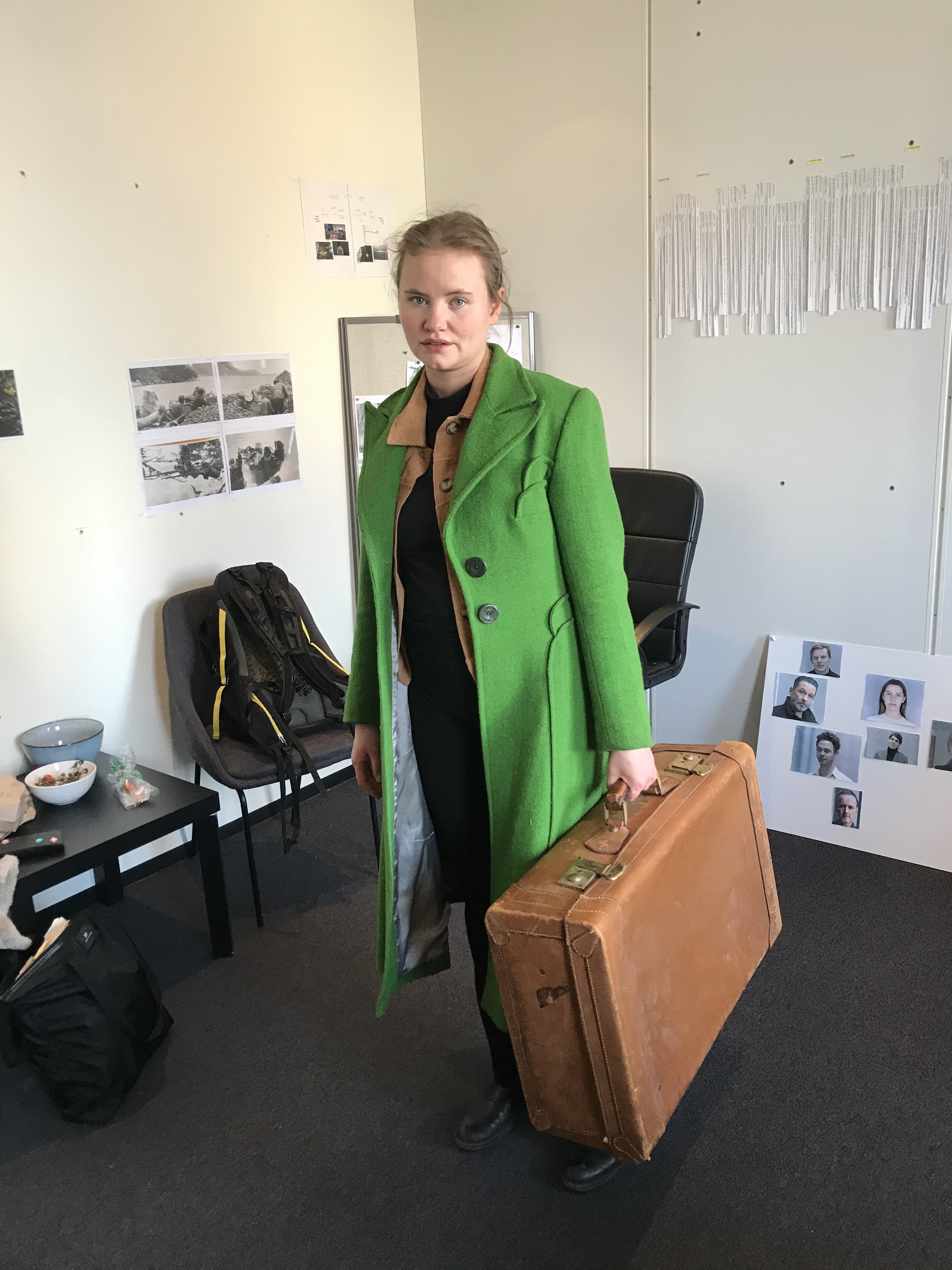
Kristine Hartgen photographed by an iPhone, wearing the chroma green coat that we re-coloured in the LUT
With everyone properly convinced – myself included, that the technique would work, we could get the coat production ready, and do some final tweaks on the colour in Resolve. The film then ended up shooting over the course of two years because of the pandemic, but finally ended up in the grading suite in December 2021. And once more we were positively surprised by the utility of the green screen coat.
Because it was already singled out in the LUT, we could easily transform the coat without touching the rest of the image. For example, we could juice it up a bit in wide shots where she was just a small figure in a large crowd. And we could tone it down a bit in closeups where you wanted all the attention on her face.
In theory this specific technique should translate to other colours, but I don’t think we could have changed so easily from green to red or blue. You’d need a strong red or strong blue, and a certain idea about what colours will be in your surroundings when you are shooting.
Thanks to the excellent craftmanship of all departments involved, and the trust we had in each other, we were able to achieve what we almost had given up. And discovered new ways to use the tools at our disposal. Testing is always key, but my experience tells me that whenever I’m in doubt about a colour, it’s better to go too saturated, because the other way around is really hard to key out. The movie is currently number one on the charts in Norwegian cinemas, and will hit the rest of the world later this year.
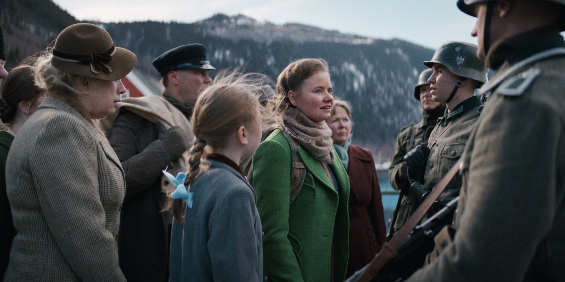
The special colour helped us identify her in crowds of people

An iconic figure much thanks to our fantastic costume designer Karen Fabritius Gram

For closeups we could easily dial down the coat a bit to bring attention to her face

For wideshots we could dial up the coat to make sure audiences would notice her

Another example of a wideshot where a little extra saturation brings her out on the big screen