
Made in Oslo: Ripping Apart the ARRI Alexa

Copyright © Tordenfilm / Viaplay
«Made in Oslo» recently premiered on Viaplay in the Nordic region, and will soon face an International audience at the 61st Monte-Carlo TV Festival. The show always intended a cinematic approach, and ended up being part of my creative life for more than three years.
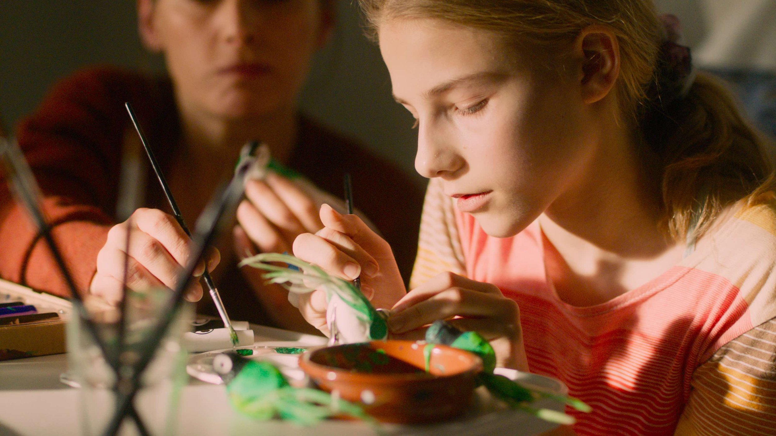
It’s a bit of a cliché, but «Made in Oslo» really IS a story about life itself. About the conception of it, about death, and about the meaning of everything in between. I started conceptualizing a pilot back in 2018, and worked closely with series creator Kathrine Valen Zeiner on how we could make our visuality an integral part of the script itself. It’s a privilege for a cinematographer to be invited at such an early stage, and we were able to come up with concepts and ideas that really blossomed when we planned for principal photography a few years later.

Woman With a Parasol by Claude Monet

Sick Child by Edvard Munch
Our early moodboards and inspirations were filled with elements from nature. We knew that we wanted an «organic» look to the cinematography. I showed some inspirations from impressionistic and expressionistic painters, where the clarity of the scene was not as important as the colours and the light and the mood. I then dug up some of my old 35mm cross processed – and often expired, analog film stills. Cross processing adds an expressionistic twist to photography by shifting colours in an unpredictable fashion, enhancing contrasts and highlighting the structure of the film by increasing grain. This was an idea that also struck a note with director Marit Moum Aune, who encouraged further investigation.

Cross processed 35mm still image, with accidental double exposure
Cross processed 35mm still image

Cross processed 35mm still image
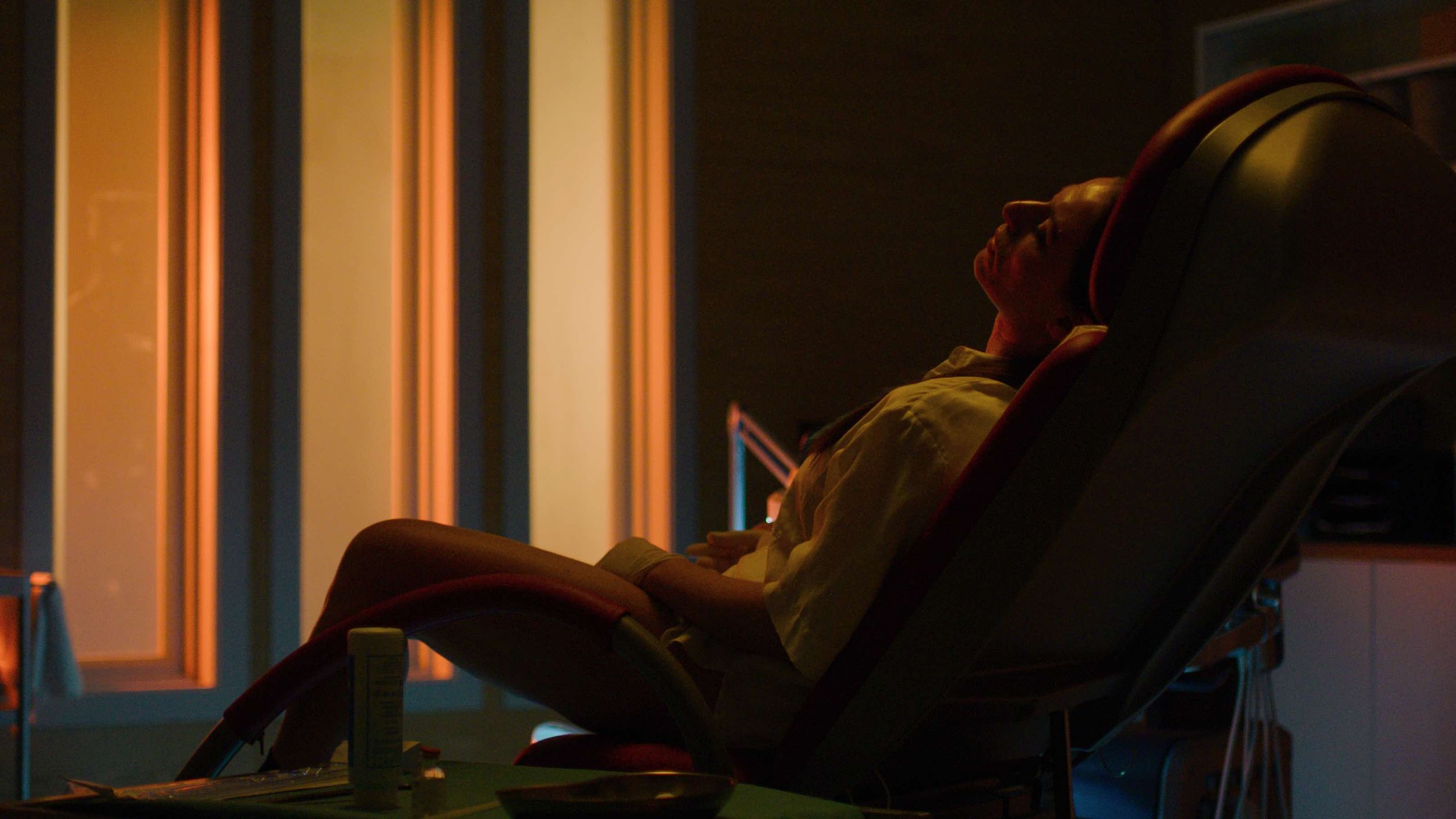
Unfortunately it was not possible for us to shoot on analog film for several reasons, economy being the most important one. So we started working with the digital sensor to see how we could manipulate it. I knew the ARRI would be a good choice, because the sensor is so robust. Most current digital sensors have this interesting feature where shifting the ISO basically just moves medium grey up or down on the latitude scale. So if a native ISO of 800 gives you equal latitude above and below grey, increasing the ISO will not only give you more sensitivity, but also increase your highlight latitude in exchange for less shadow latitude. This, in theory, would simulate the response of the film emulsion, where more light just creates a denser negative, and you in theory have endless highlight latitude.
We actually ended up pushing the camera to ISO 2500, which immediately sounded like a bad idea, but all our tests indicated the opposite. We were able to bring out this great looking sensor noise, and opened up a really interesting space in the highlights to work with lighting.
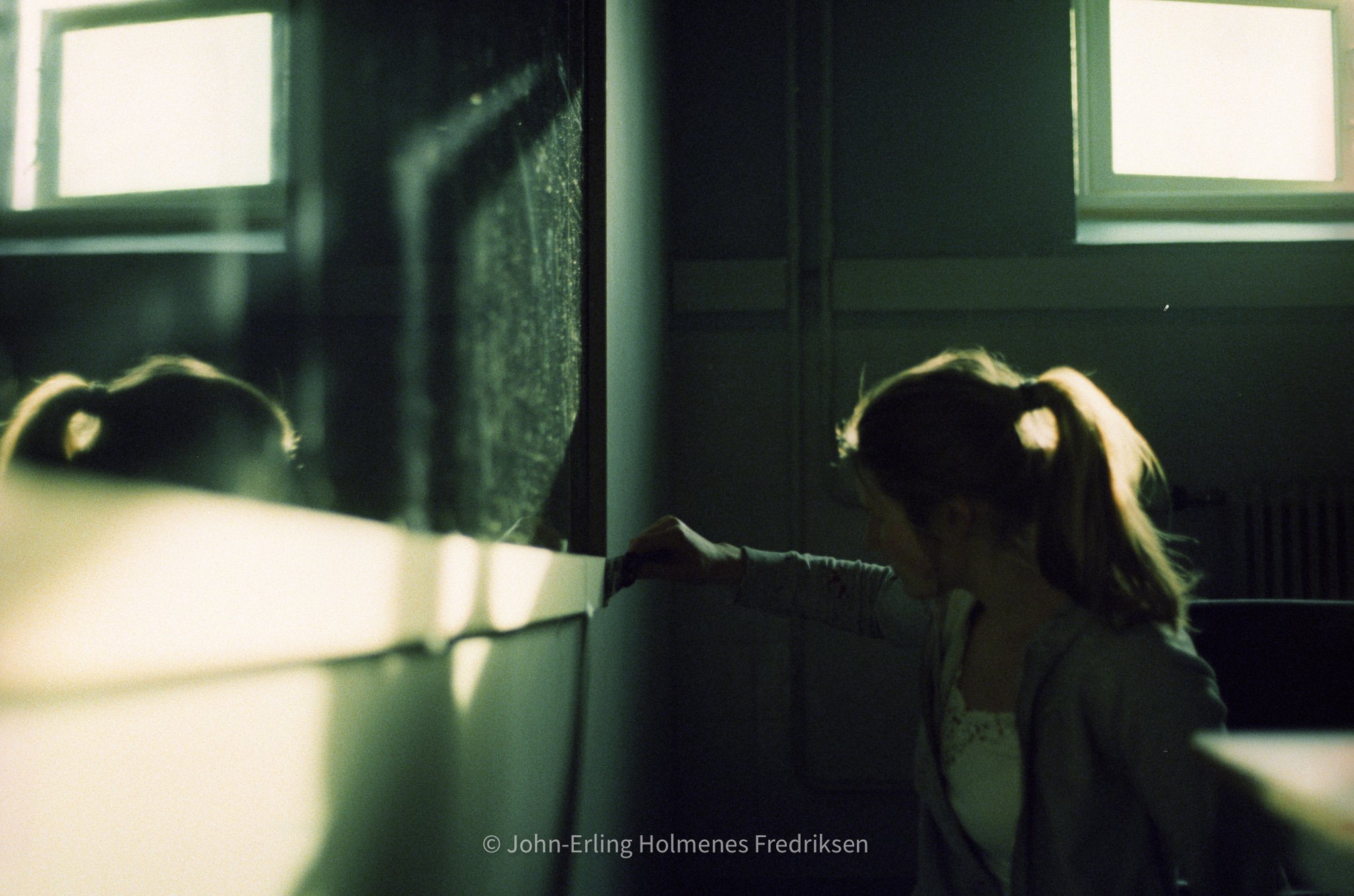
Suddenly we were able to shoot really intense light into our scenes, and let it bounce around. My gaffer Henning Høifødt really embraced the opportunity, and helped me with a raw, un-defused approach. Without clipping the highlights, we could light faces with just the bounce from different surfaces in the room, or the direct light. And the intense beams really reminded us of the presence of nature and her inevitability that had initially inspired us. The bouncing surfaces also affected the colours in ways that a traditional «neutral white» bounce does not, giving a naturally colourful look to start with.
Intense light and bright highlights were not a problem with the high ISO. Notice the beautiful bounceback on her chin from the Molebeam hitting her shoulder.
The next step was treating the colours. Together with our colourist Camilla Holst Vea, we made three different LUTs that would push the colours in different directions. These were directly inspired by my cross processing experiments. One would go pink, one would go cyan and one would go yellow. We decided to bring them all into the camera, and pick and choose on the day depending on what mood we wanted, or what worked well for our different sets and locations. By not attaching any rule to this, I hoped to achieve some of the randomness that can happen when cross processing actual 35mm film negative.

Cyan LUT

Yellow LUT

Pink LUT
We pushed the ARRI Alexa into very uncomfortable territory, but it held up amazingly well, and allowed a distinct look that deeply affected how we lit and how the images in the end look. With the texture locked into our camera, I decided to complement it with the beautiful Cooke S4 lenses, adding Black Satin diffusion to subtly glow the images. The whole process was an extremely satisfying experience, where one of the keys was the early start that allowed us to really dive deep into the material, and craft a look that was deeply married to the story.

Copyright © Tordenfilm / Viaplay

Copyright © Tordenfilm / Viaplay
Copyright © Tordenfilm / Viaplay

Copyright © Tordenfilm / Viaplay

Copyright © Tordenfilm / Viaplay

Copyright © Tordenfilm / Viaplay

Copyright © Tordenfilm / Viaplay